Business and productivity
Reports, dashboards and PDFs built from your data
Your CSV and Excel files as charts, then as a PDF report delivered on schedule.
Included from the Personal plan
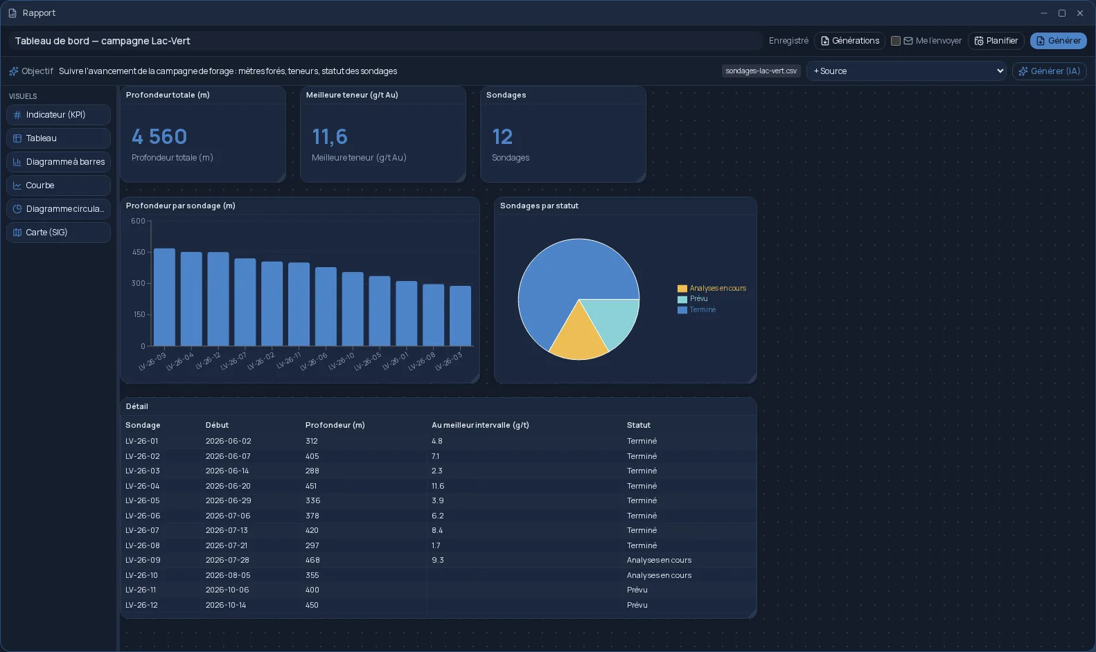
A dashboard, by drag and drop
Reports is a free-form canvas: you drag visuals from the palette, then place and resize them as you would on a page. Each visual reads a data source, and you choose the column for the axis, the value to measure and the calculation to apply: sum, average, count, minimum or maximum.
- Key indicator, table, bar chart, line chart and pie chart.
- A map for a geographic layer, coloured by class with its legend.
- Saved automatically with every change.
Your data, where it already lives
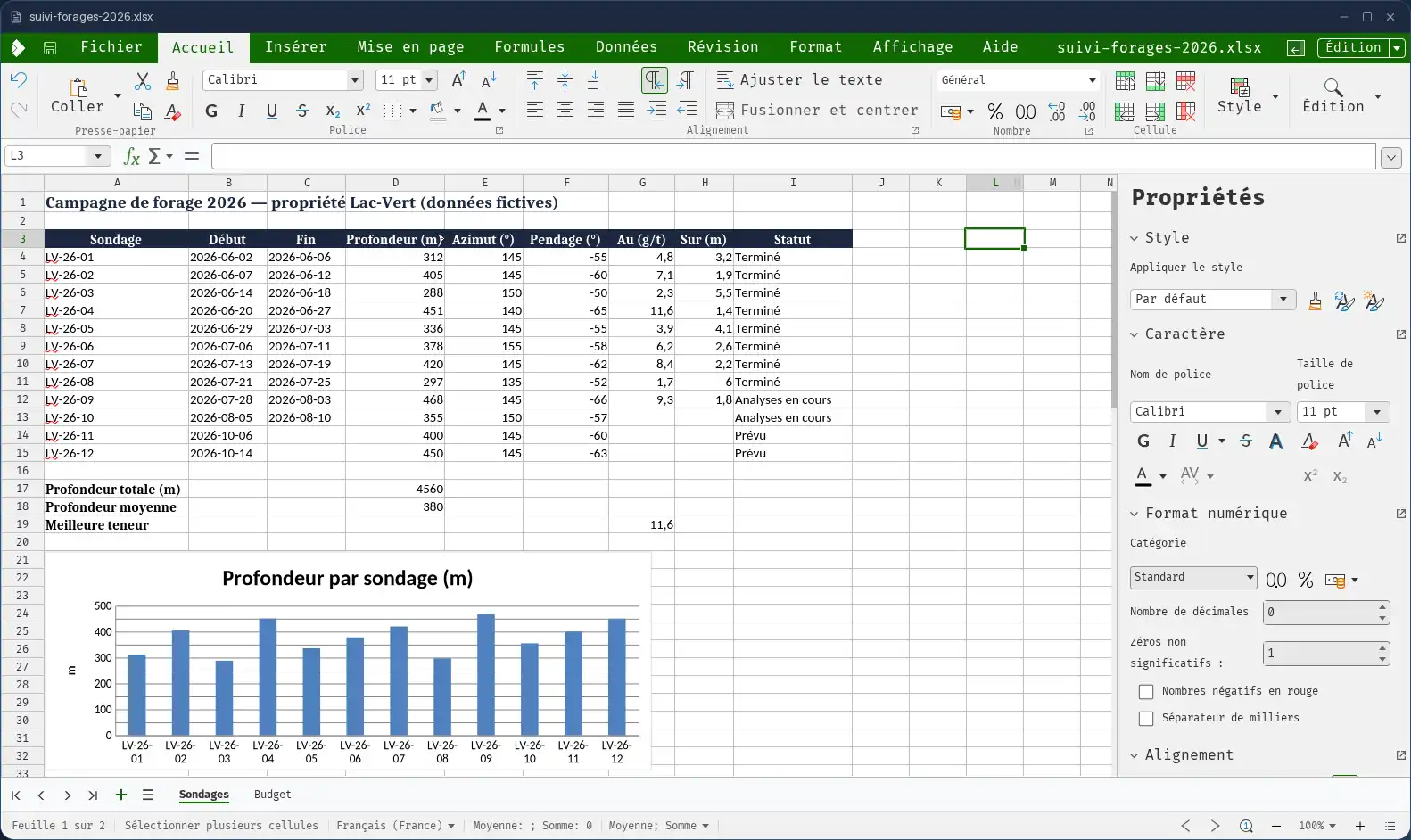
Sources are your CSV and Excel files, wherever they are filed in your Files, and the results of your plans: a data analysis or query becomes a chart directly. No import, no copy.
Short on time? Describe what the report is for — “sales by region and monthly revenue trend” — and artificial intelligence designs the visuals from your sources. You then fine-tune them by hand.
A PDF, delivered without a second thought
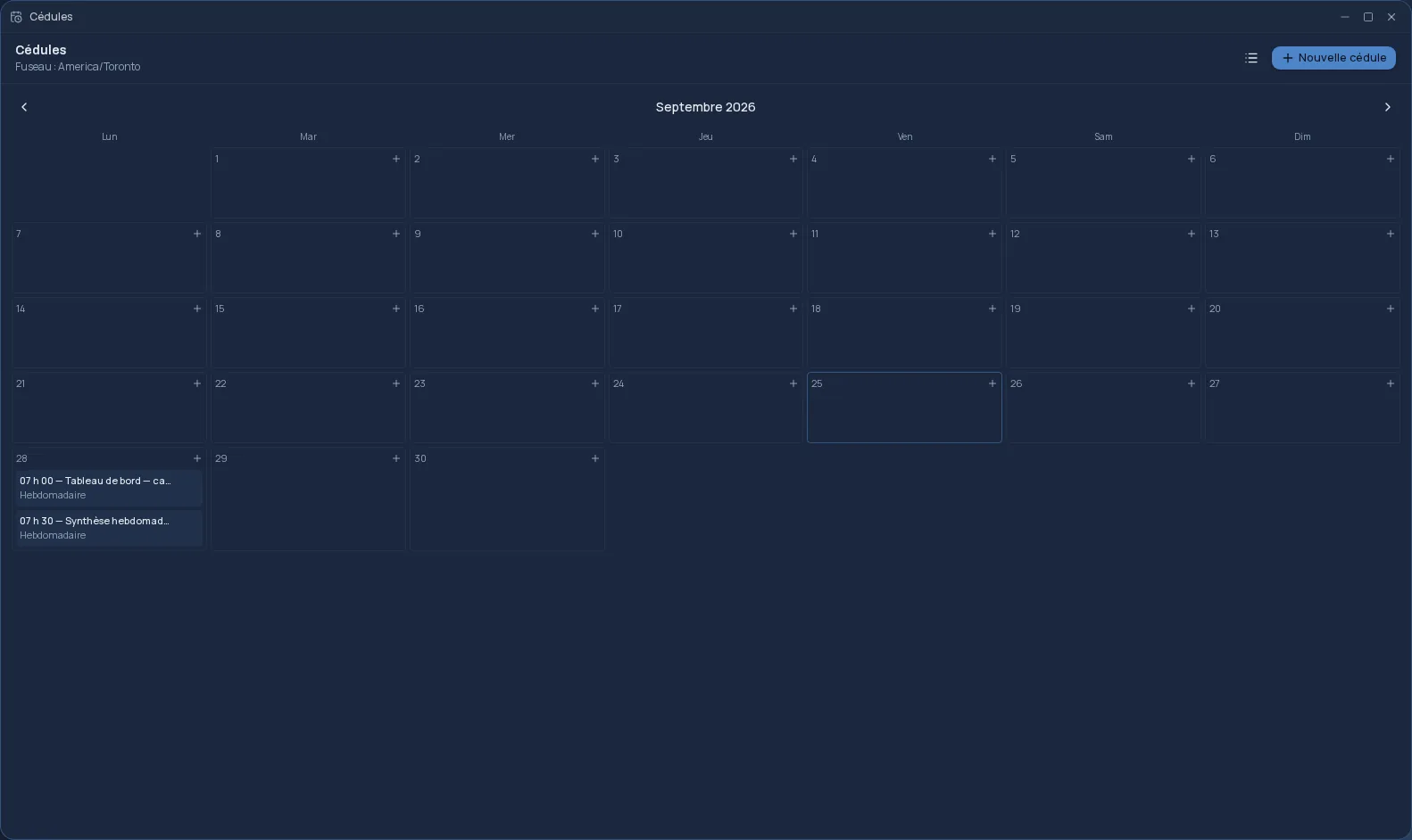
“Generate” produces the report as a PDF, which you find in the generation history. It can also reach you by email as an attachment, or go to your Google Drive or OneDrive. And with “Schedule”, the report regenerates on its own, every week or every month, from the data of the day.
A report can be shared with a team, who can view it and generate it in turn. Reports is included from the Personal plan.
Frequently asked questions
- What data can I use?
- Your CSV and Excel files stored in Files, and the data produced by your plans. For a map, a geographic layer in GeoJSON format.
- Can I get the report every Monday?
- Yes. “Schedule” regenerates the report at the date, time and frequency you choose, and the “Email it to me” option sends it to you as a PDF.
- Can my colleagues see the report?
- Yes. Share it with a team: its members can view it and generate it.